


From Spreadsheets to Real-Time Insights: Transforming How We Understand Team Performance
As Mereka grew to 40+ GitHub repositories across multiple engineering teams, leadership faced a familiar challenge: understanding what was actually happening across the organization. Engineering managers spent hours each month compiling reports, DORA metrics were impossible to calculate, and there was no way to identify team health risks before they became critical. We needed a better way to see the full picture — and AI helped us build it.
The Challenge
Before building our Team Analytics Dashboard, getting answers to basic questions was surprisingly difficult. "How productive was last quarter?" or "Are any team members at risk of burnout?" required manually navigating through GitHub's interface, copying data into spreadsheets, and hoping the numbers were accurate.
The problems were clear:
- No centralised visibility: Each repository existed in isolation. There was no organisation-wide view of engineering activity.
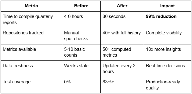
- Manual reporting overhead: Engineering managers spent 4-6 hours every month just compiling activity reports.
- No industry-standard metrics: DORA metrics, the gold standard for measuring software delivery performance, were impossible to calculate without dedicated tooling.
- Blind spots on team health: We had no systematic way to identify knowledge silos, burnout risks, or collaboration patterns.
- No AI impact tracking: As teams adopted GitHub Copilot, we couldn't measure whether it was actually helping.
The Solution: Building with AI, for AI Insights
We decided to build our own Team Analytics Dashboard, and we used AI throughout the development process. The platform automatically collects data from GitHub every 2 hours, calculates key metrics, and presents them in an interactive dashboard that leadership and team leads can access anytime.
What we built:
- Automated data collection: No more manual spreadsheets. The system syncs with GitHub automatically.
- DORA metrics at a glance: Deployment frequency, lead time for changes, and mean time to recovery — all calculated automatically.
- Team health indicators: Engagement scoring, burnout risk detection, and "bus factor" analysis (identifying knowledge concentration risks).
- AI attribution tracking: See the ratio of AI-assisted vs. human-written code across the organisation.
- Collaboration insights: Visual network graphs showing how teams work together across repositories.
How AI helped us build it faster:
During development, approximately 60% of the code was written with AI assistance. We used Claude for architecture decisions and complex problem-solving, GitHub Copilot for day-to-day coding, and the combination dramatically accelerated our development velocity.
Measurable Results
The transformation was immediate and quantifiable:
Time savings:
- Engineering managers save 4-6 hours per month on reporting time now spent on actual team support.
- Report generation that took hours now happens in seconds.
Quality and reliability:
Because we built this for production use, we invested heavily in testing: over 2,000 automated tests ensure the system is reliable and the numbers are accurate. Every metric can be traced back to its source, and every report is reproducible.
Cultural Transformation
Beyond the metrics, the dashboard changed how our teams work:
From reactive to proactive management
Team leads now identify burnout risks and knowledge silos before they impact delivery. Instead of discovering problems during retrospectives, they're addressed in real-time.
Self-service analytics
Engineering managers no longer need to request reports from leadership. They access real-time metrics themselves, enabling faster decisions and more autonomy.
Data-driven conversations
Team discussions now start with data, not opinions. Whether it's planning sprints or discussing process improvements, everyone has access to the same objective information.
Trust through transparency
Every metric comes with methodology documentation. Users can click any number to see how it was calculated, what data sources were used, and any caveats. This transparency builds trust in the data.
What's Next
The Team Analytics Dashboard is just the beginning. We're planning to expand it into a complete "Team Operating System" by connecting more of the tools our teams use daily:
.png)
Our vision:
We aim to have a single dashboard that shows how work flows from ideas (in ClickUp) → discussion (in Slack and Drive) → execution (in GitHub) → delivery (deployments). Leaders will have a complete picture of team activity across all tools — without any manual data gathering.
The Outcome
Today, Mereka operates with significantly better visibility into engineering performance. What started as a solution to a reporting problem has become a strategic asset for team health, resource allocation, and process improvement.
The dashboard demonstrates how AI can accelerate not just software development, but organisational transformation. By investing in the right tools and using AI throughout the build process, we created something that delivers immediate value while positioning us for continued evolution.
This case study demonstrates how structured AI adoption in software development can deliver substantial productivity gains while building long-term organisational capability. The Team Analytics Dashboard is now being expanded for use across all departments at Mereka.
Key Takeaways:
- Manual reporting drains valuable time, automation frees teams for higher-value work
- DORA metrics and team health indicators should be visible to everyone, not just leadership
- AI-assisted development accelerates delivery and improves code quality
- Transparency in metrics builds trust; every number should be explainable
- The future is connected: integrating multiple tools gives the complete picture


